 User Experience Design
Is the process of enhancing user satisfaction by improving the usability, accessibility, and pleasure provided in the interaction between the user and the product.
Discovery Phase
Complex projects will comprise significant user and competitor research activities, while small projects may require nothing more than some informal interviews and a survey.
Content Analysis
A method for studying and/or retrieving meaningful information from documents.
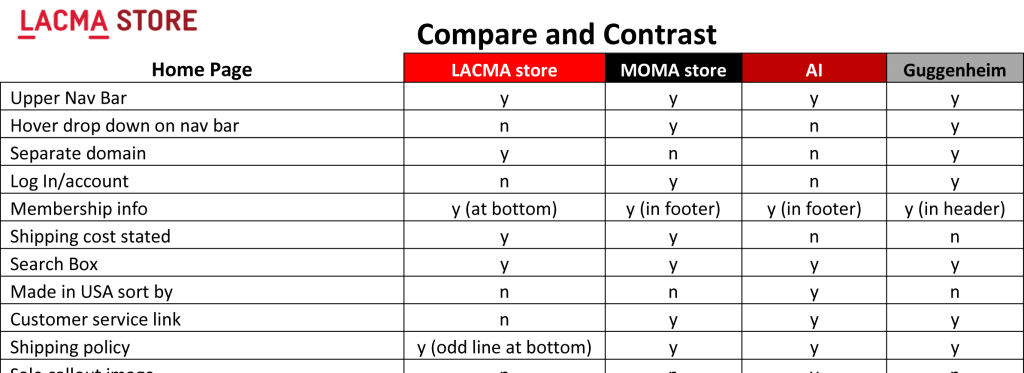
Comparative/Competative Analysis (CCA)
Performing an item by item comparison of two or more websites or apps to determine trends or patterns.
A method for identifying the strengths and weaknesses of competing products or services.

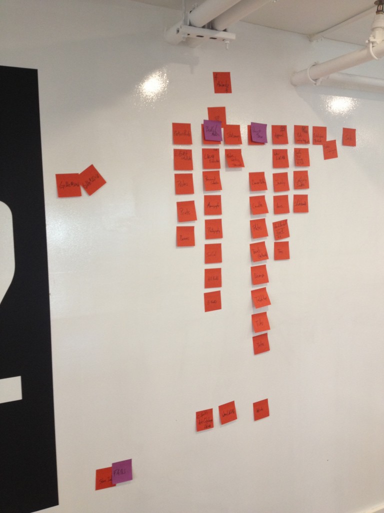
Card Sort
A method for organizing information that involves sorting a series of cards into groups that make sense to the participants.
Each card represents a single term, function or object.
Card sorting helps to reveal users’ mental models, or patterns that the end users would expect to find.

Information Architecture (IA)
Focuses on organizing, structuring, and labeling content in an effective and sustainable way. The goal is to help users find information and complete tasks.
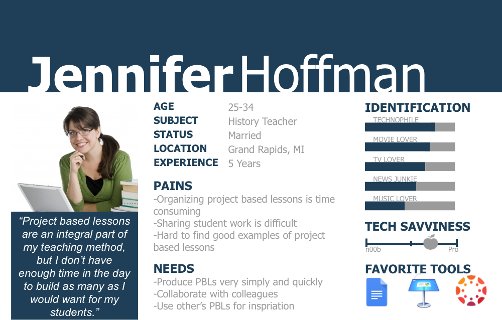
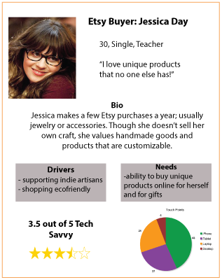
Persona
Fictional person created to model and describe the goals, needs, and characteristics of a specific type or group of users.
Does not describe a real, individual user nor an average user. Often includes made-up personal details to make the fictional person more “real”.


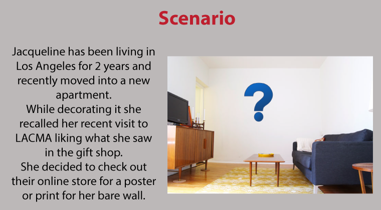
Scenario
A story which has the key elements of a realistic situation when the user would interact with the system being designed or evaluated.
The scenario includes consideration of the user’s goals, tasks and interaction. Scenarios can be created for user groups, workflows or tasks to explore, understand and test the different types of needs and goals.

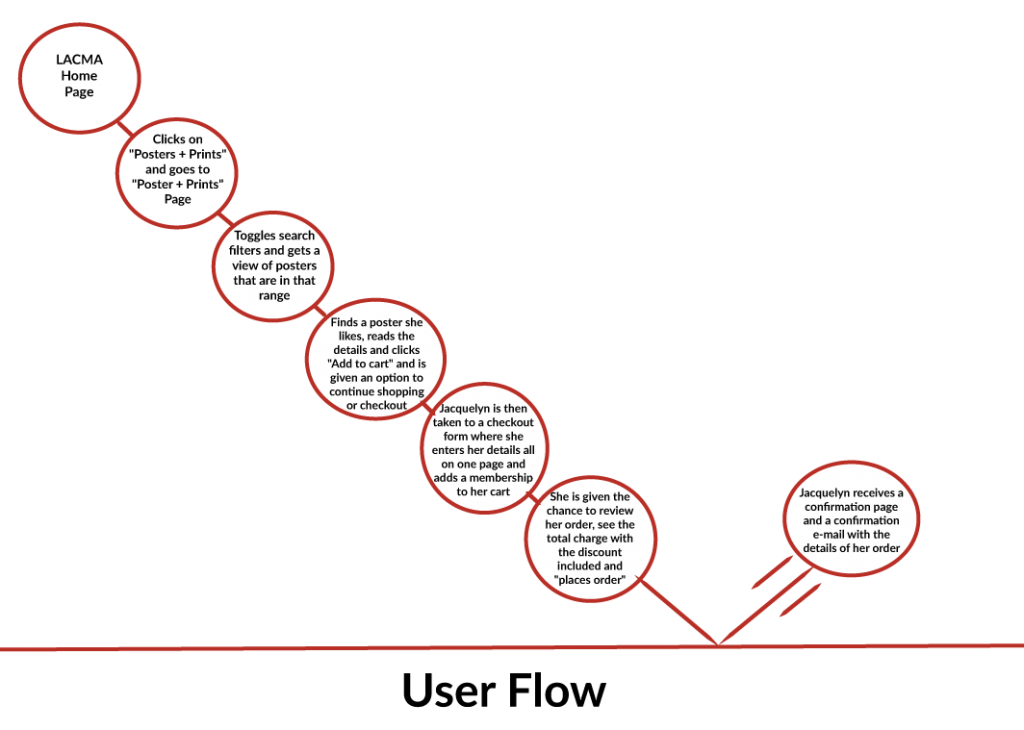
User Flow/Journey
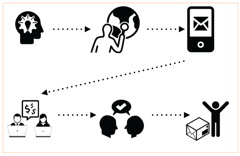
The step by step journey that a user takes to reach their goal.
A user journey is a sequential series of interactions with a product or service that a user has, typically with a start point (such as going to a website home page) and an end point (such as finding the desired information).


Onboarding Strategy
A plan to facilitate the user’s understanding to learn the skills and behaviors required to utilize the product effectively.
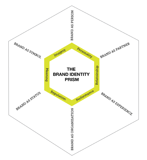
Brand Identity Prism
Understanding the Brand’s prism can help you position your brand better and design effective marketing strategies related to the brand’s identity.
The brand can be communicated better if its identity is well established.
You can eliminate techniques that may not blend with the brand’s perceived image.

Creative Brief
A creative brief is like a road map.
It can help keep projects running smoothly and prevent misunderstandings and delays by:
– Connecting objectives with creative strategies
– Building team consensus
– Aligning expectations
– Defining clear, measurable goals
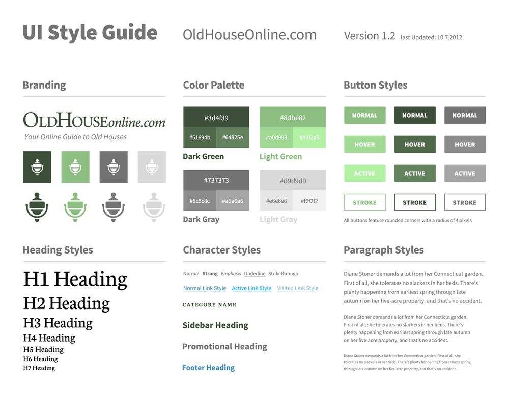
UI Style Guide
A set of standards for the writing and design of documents typically including colors used, font type and size.

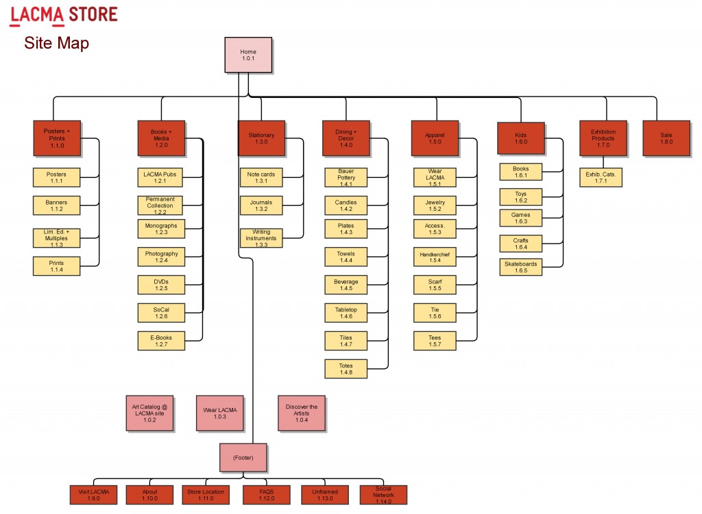
Sitemap
A complete list of all the pages available on a website.
When presented as content on a Website it is typically organized in a hierarchical listing.
Alternatively, the same information can be represented with boxes and arrows that visually show the hierarchy of the interface.

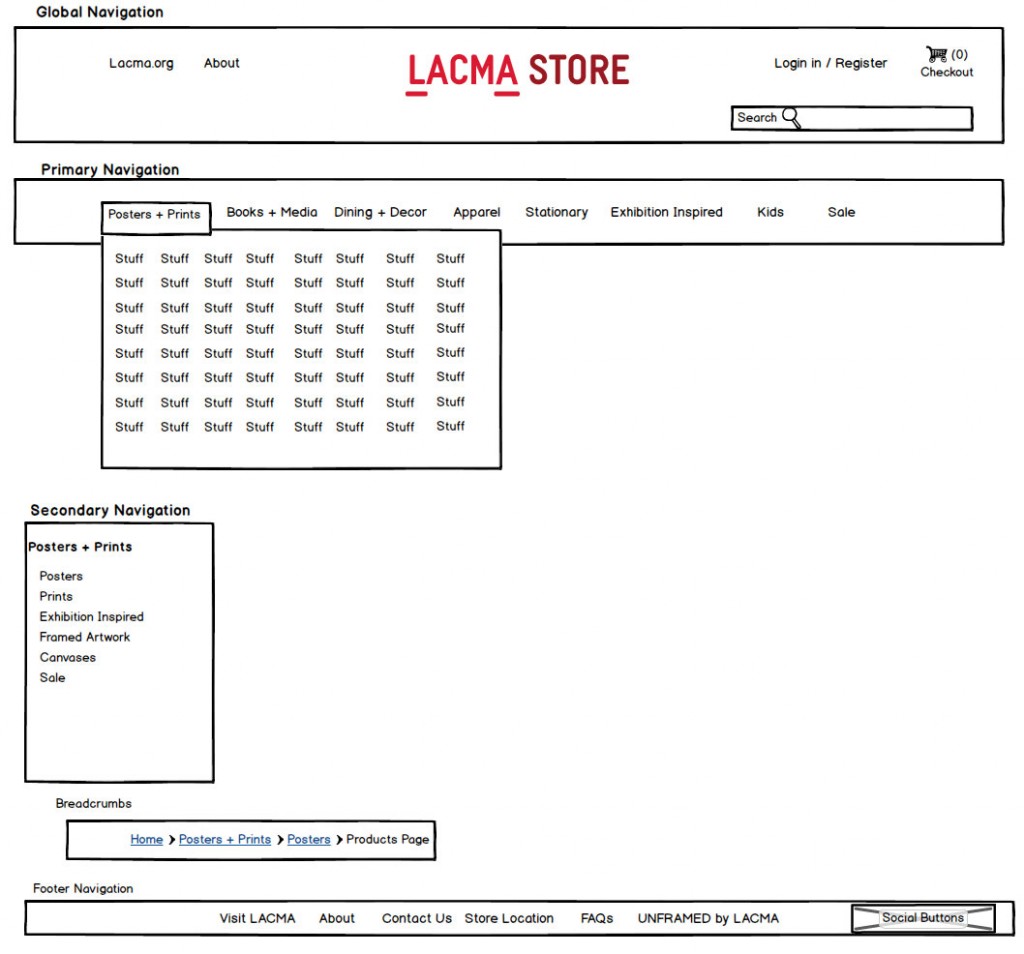
Navigation Schema
The layout of all the navigation elements including global navigation, footer and any secondary navigation.

User Testing
The process of validating that a system meets pre-specified usability objectives.
These objectives should be task-based, and should tie directly to product requirements, including results from analytic tools such as personas, scenarios, and task analysis.
Testing may validate a number of objective and subjective characteristics, including task completion, time on task, error rates, and user satisfaction.
Testing may be formal or informal, may be local (with testers physically present at same location as users) or remote, and may result in qualitative or quantitative data.
Testing may occur at any point in the development cycle, from early analysis through product delivery and beyond. Testing may be based on paper designs, models, or display mock-ups, as well as on products in development and completed products.
Wireframe
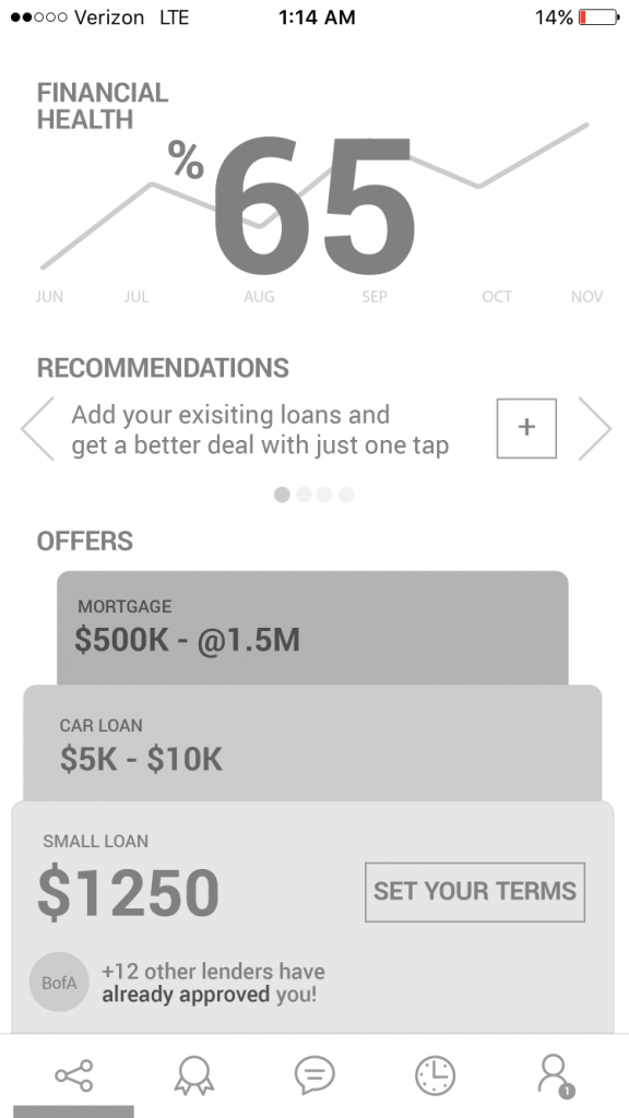
Rough outline of navigation and content elements that make up a user interface.
Either done with pen and paper or with wireframing software.
Typically visual design and precise layout are not addressed.


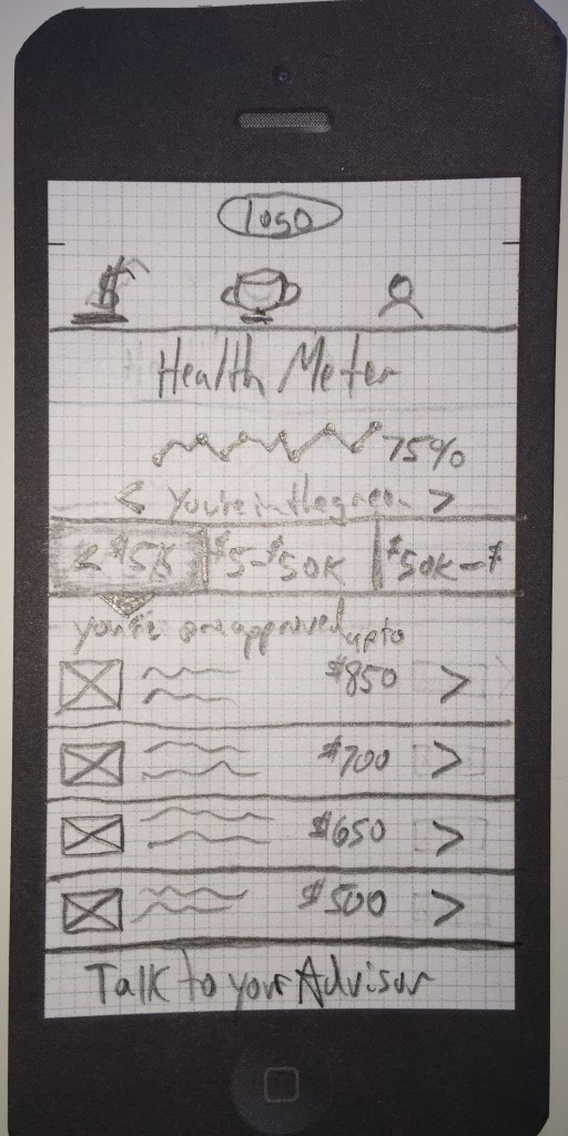
Lo-Fi
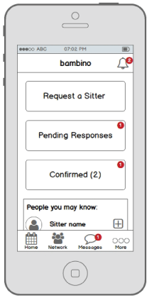
A rough, often hand-sketched, drawing of a user interface.

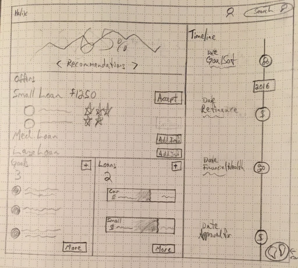
Mid-Fi
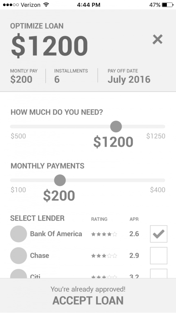
Mid-Fi wireframes are typically a black, white and gray version of the product with possible a couple of nods to the UI elements. This version helps focus on the features, functions and flows.


Hi-Fi
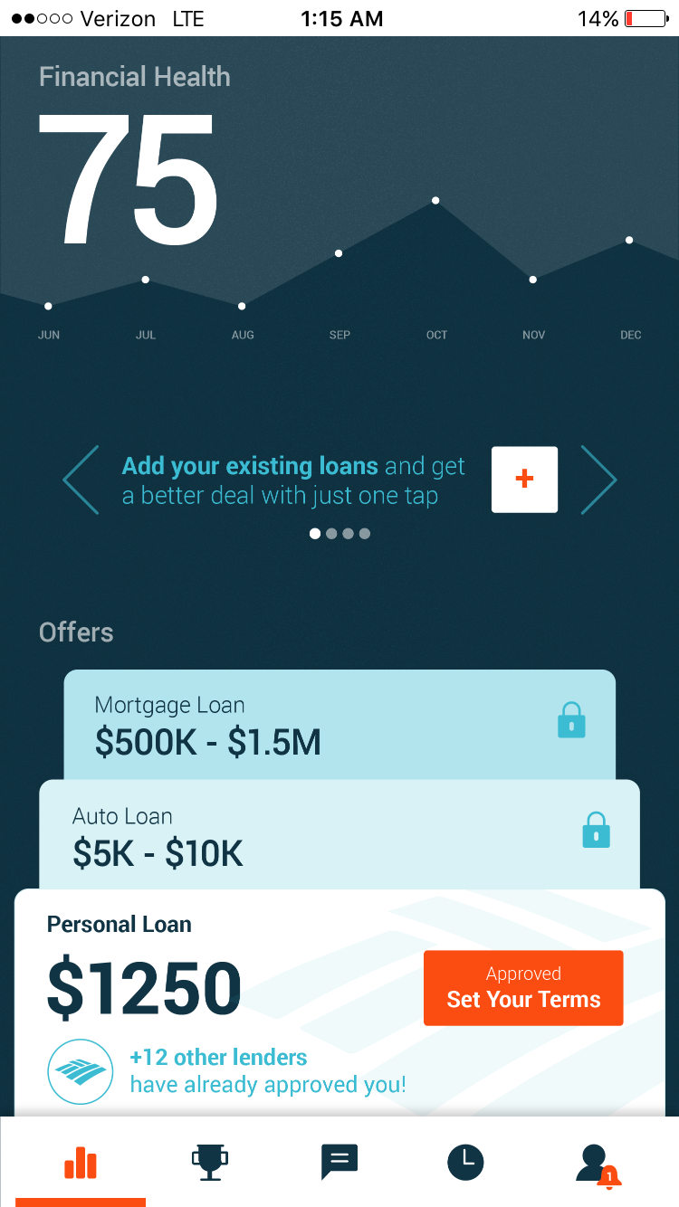
Wireframes which are quite close to the final product, with lots of detail and a good indication of the final proposed aesthetics and functionality.

Prototype
A guide for the layout of a website or app, giving an indication of the direction that the product is heading.
Used to capture initial concepts and layouts to gather feedback from users, as well as project participants and stakeholders
Click on the below to see a prototype:

Sources:
 User Experience Design