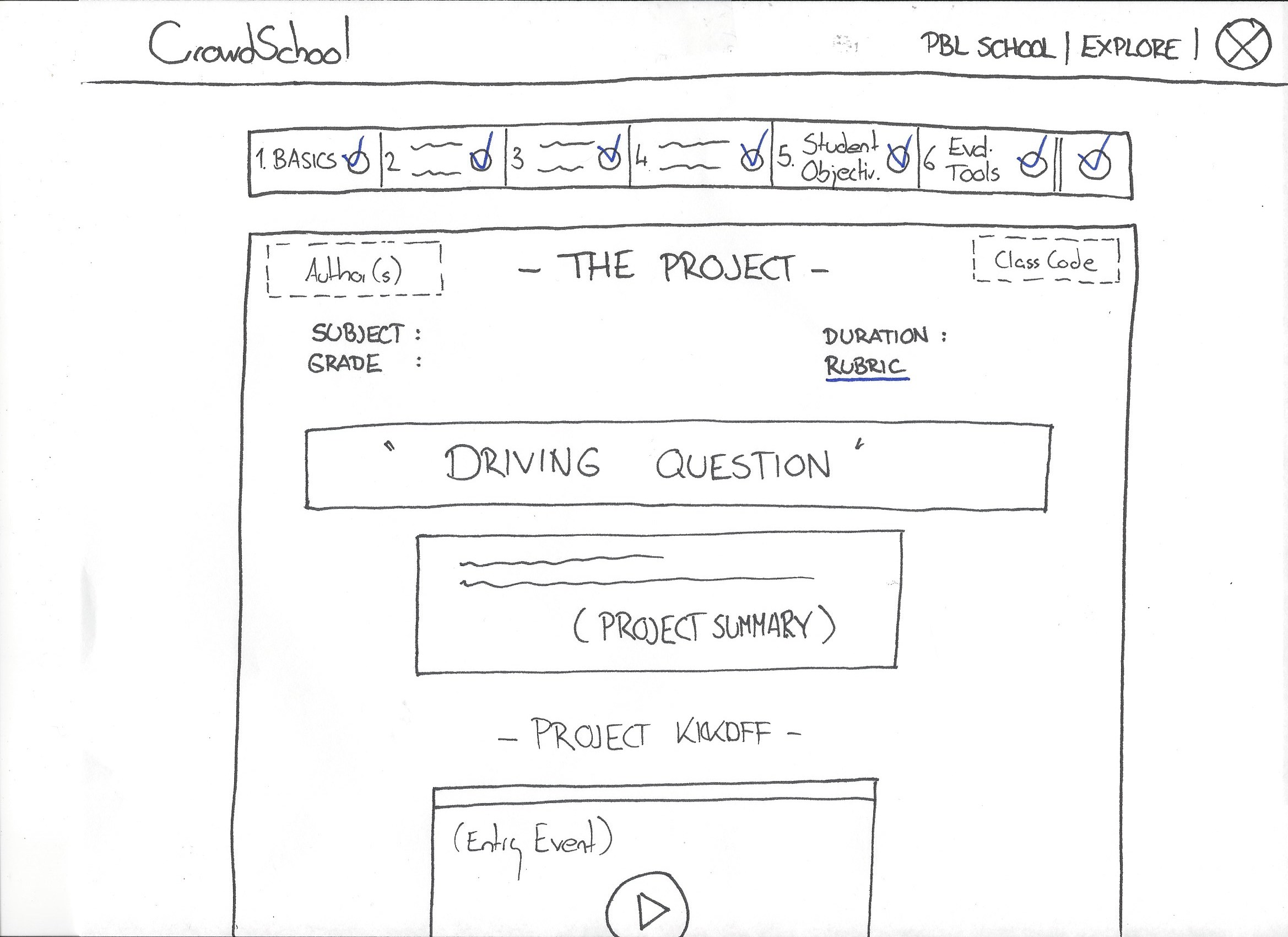
Solution
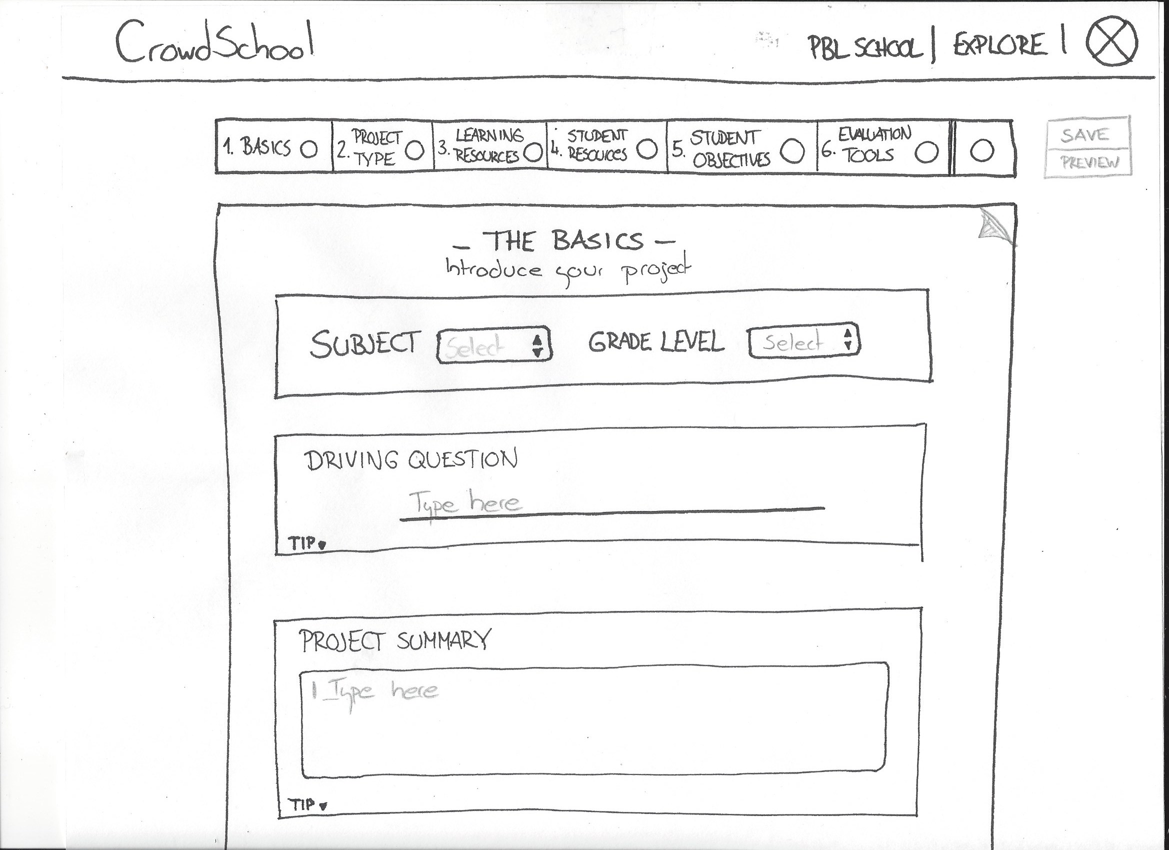
Clear progression of progress through the project creation process as well as an option to view the project prior to completion.
Role
I worked closely on the project with 2 other UX designers. I focused on the user testing, user flow, time management, wireframes and prototyping.
The Client
Crowdschool is an online Project Based Learning (PBL) creation tool. They also offer a “marketplace” for the teachers to either share, buy or sell their projects to other people.
My Process
Step One: Research
CrowdSchool’s Current State:
-
Entering a project was confusing
-
Large drop off rate
-
Low rate of return users
-
Low quality projects were entered into the database
Below are are few screenshots of their current process:


Competitors
Teachers have found a few different tools to create projects with the largest and most expensive one being the Buck Institute.
Prices were high for the program and out of reach for most teachers.
Some of them ended up using common website building tools as well since it was free.

We also did some comparison research to get ideas on what a good flow might be for adding in projects.


User Testing
We then tested the current product with a few different teachers to see what their thoughts were on the process and what parts worked or didn’t work.
We also learned more about PBL and what aspects were important for the teachers or not as necessary.

Step Two: Strategy
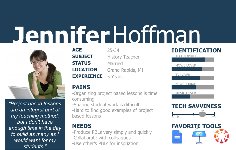
Persona
Based on the the users we tested and Google analytics we worked up a Persona to help guide us through the design process.

User Flow
We also worked up a User Flow to show some of the steps that we were not going to have time to design to explain the flow after a project was entered.

Step Three: Design
1st Round Sketches
Our first idea was to keep the design tool very open like a web design tool. The teachers would drag and drop elements directly on the project page.
They could then see exactly what they were creating for the students.

2nd Round Sketches
We presented the above sketches to our client but learned that they were looking for a more structured layout and the developer would not be able to code this design.
So we went back to the drawing board and did another round of sketches.
Iteration
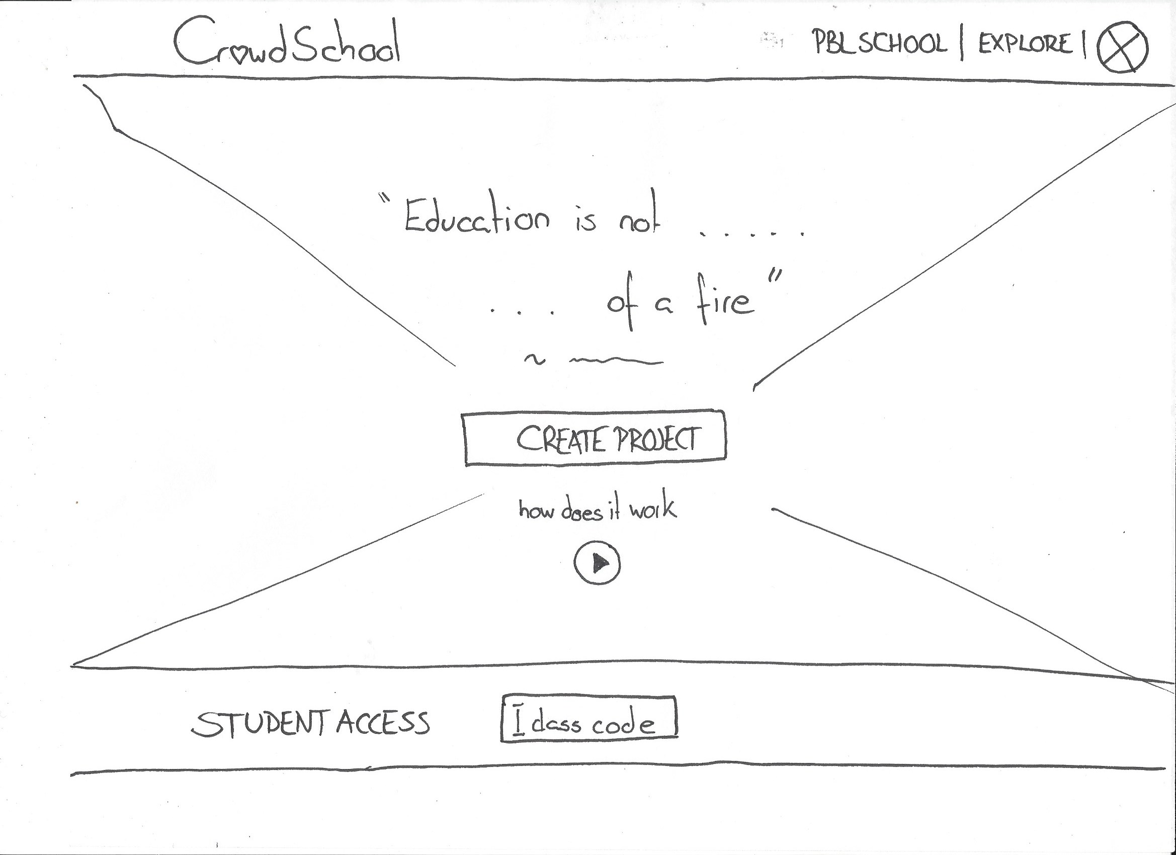
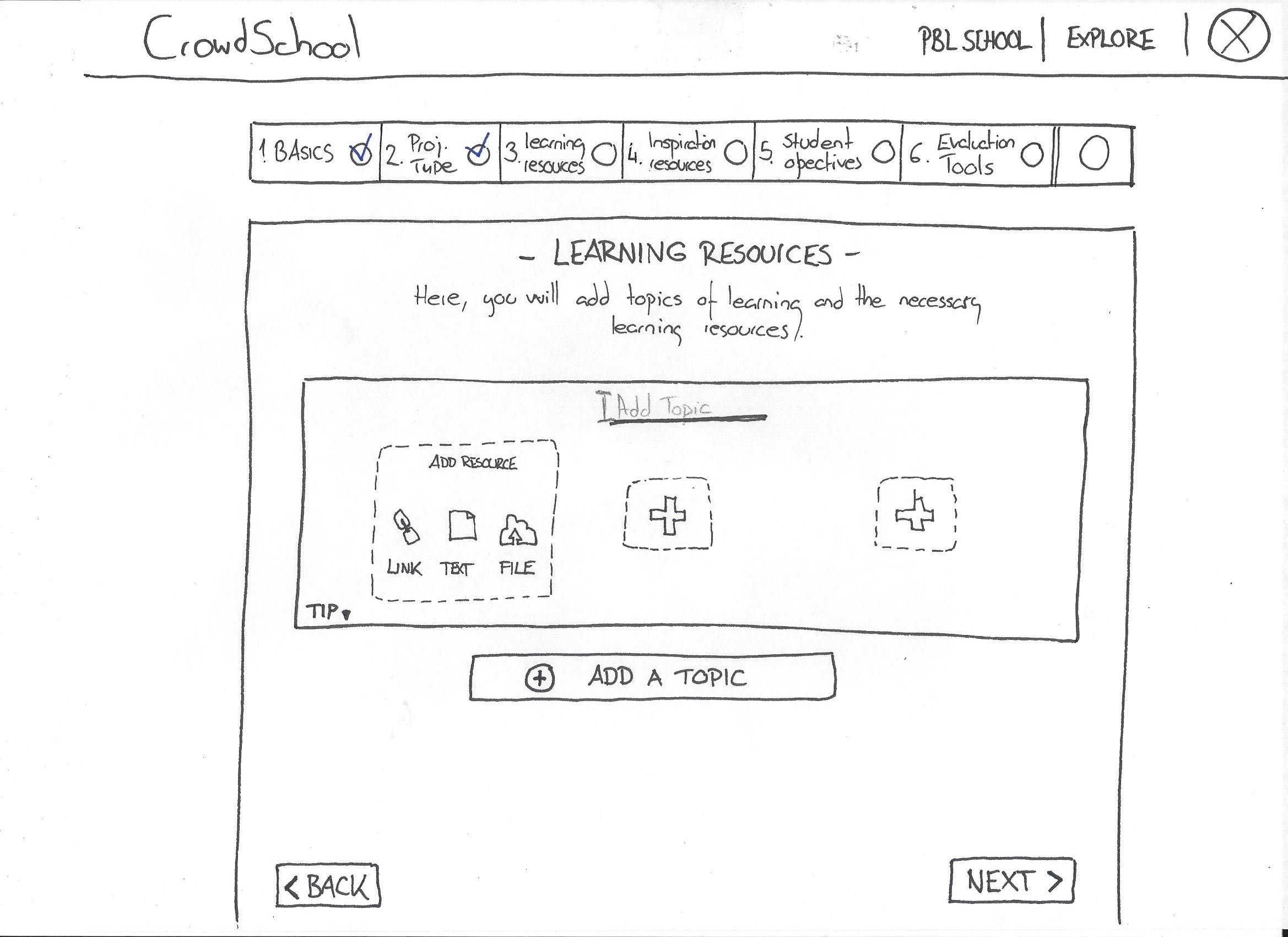
We flushed out every step of the process and tested it a few times to get to the best flow.
We tried multiple design options on all pages like the “Add a Step” example below:

Prototype
Once we completed all the steps above it was time to create all the wireframes and the mid-fi prototype. Our client wanted us to work with MyBalsamiq.
[wpdevart_youtube]XgqV_izvDsw[/wpdevart_youtube]
Update
After the client reviewed all the new design and feedback they did a redesign of their process following most of the recommendations we suggested.


