Bambino
The Client
Bambino is an on demand baby sitting app.
Challenge
After launching their MVP they were looking to update and expand the feature set.
Originally I was brought on board to mentor junior designers to design one feature, I ended
up assisting the team with a reskin of the app as well as adding in features to grow the product.
Role
UX Designer, and some UI, performing all of the below tasks.
Check Out The Finished Product
[wpdevart_youtube]vQqA9L7U08Y[/wpdevart_youtube]
My Process
Step One: Research
Heuristic Evaluation
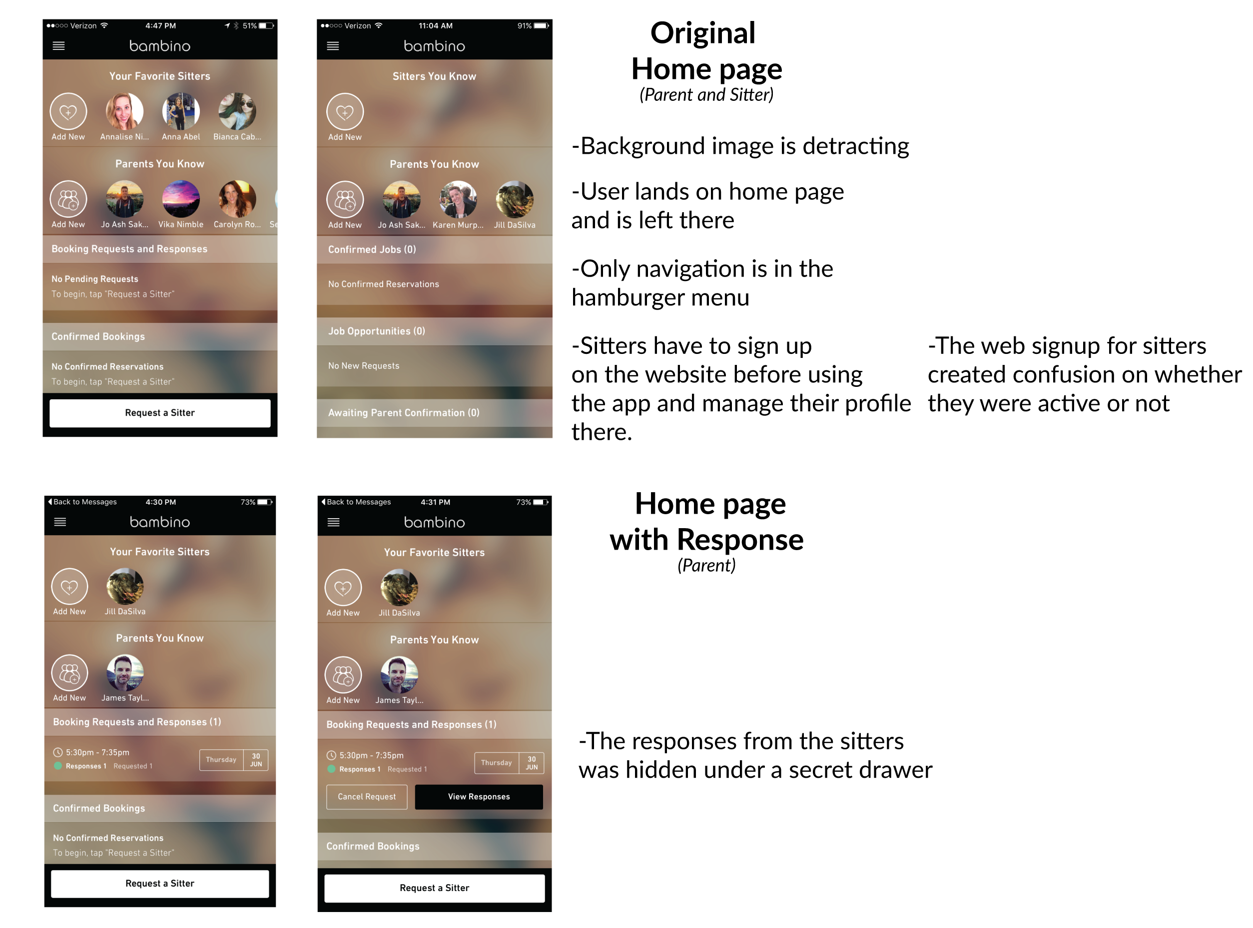
The first thing I needed to do was familiarize myself with the product. My boss (Jill DaSilva) had been working
on this project for about 6 months already so she helped me get up to speed on the project and we discussed
where the user roadblocks were.
Below are a few we uncovered:
Competitive / Comparative Analysis
There are multiple baby sitting apps and we needed to make sure that Bambino would stand out from the pack. 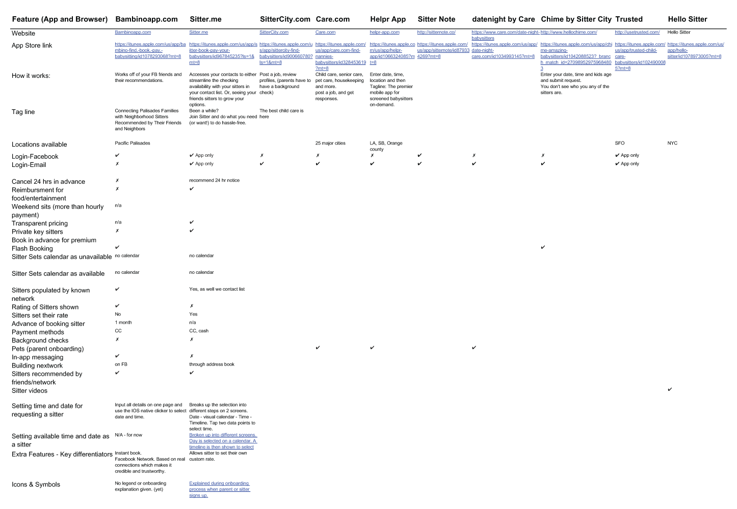
Deeper Dive
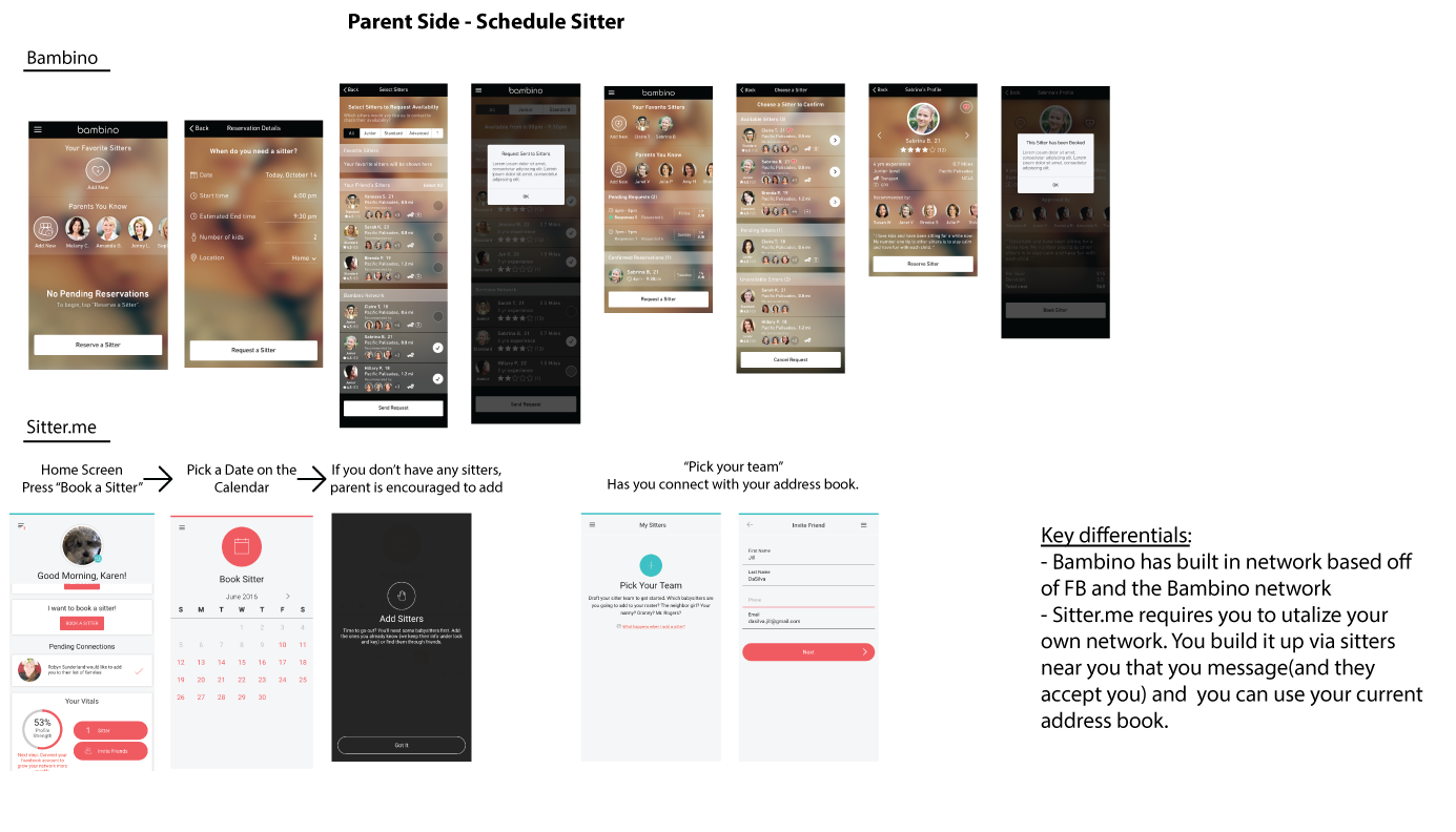
After I finished the broad view of the competitors we realized that Sitter.me was the biggest competition.
I took each section of the two apps and did a side by side comparison like the one below,
highlighting the key differentials.
Step Two: Strategy
Feature Expansion
When I first started with Bambino I was brought in to help with some of the initial research that you saw above.
As they had recently launched the MVP we started working on the “v2” of the product and worked out what features
would be added on next. For that stage, we also learned that they were open to changing the look/feel/UI of the brand which opened up a lot of doors.
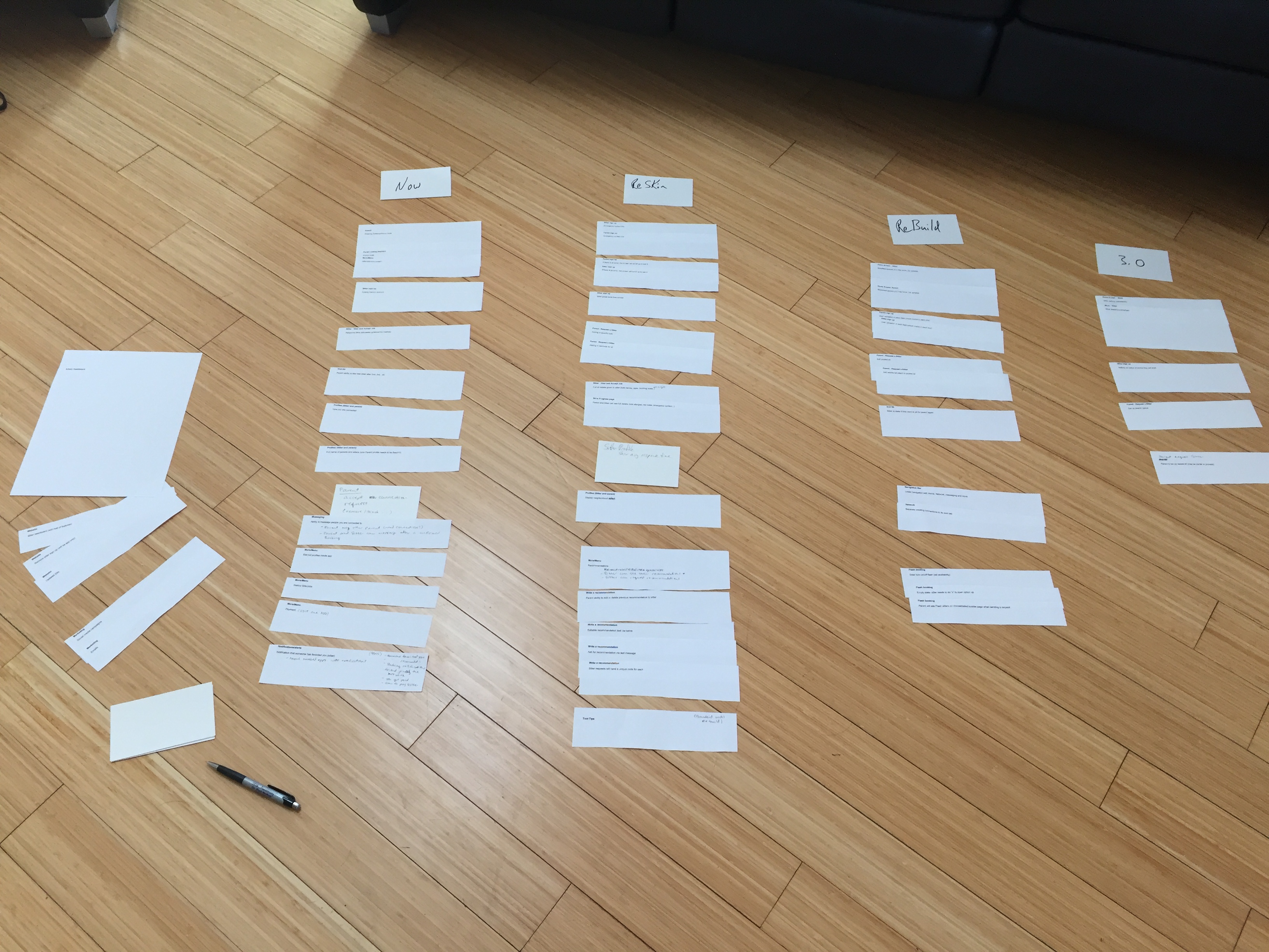
To help prioritize these new features we worked up a plan on which feature would roll out with which design update.
Features we were able to add (some of the bigger ones):
– Native Navigation Bar
– Adding Venmo as a payment system
– Sitter adding in their schedule
– Vacation mode (sitters able to pause their availability)
– In App Messaging
– Empty State landing screens (for first time users)
Working with Developers
Rules and Requirements
As we were working out the future features it then became clear that there were rules missing around profile permissions.
We worked very closely with the development team and this was one of the tools I used besides wireframes and flows to communicate.
I wrote the below rules so they knew what users could see and when.

Agile Environment
The developers were running 1-2 week Sprints and we had to keep up on the design side.
At times we would discuss an adjustment to a screen in a meeting and they would proceed with developing it even without a wireframe
Step Three: Design
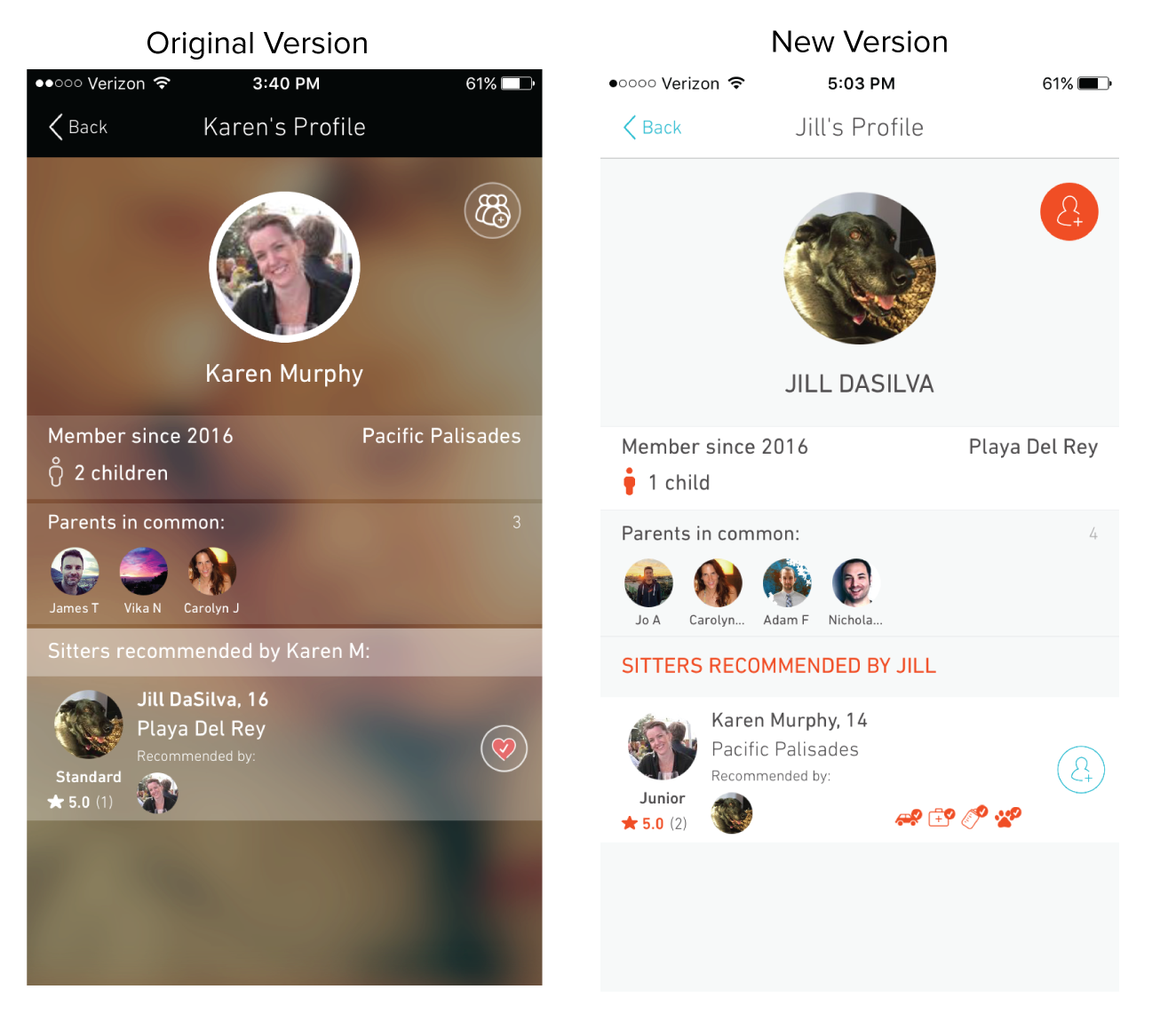
New Design!!
We were so happy that after all of our research and talks the owner wanted to move forward with
a re-skin of the app. This would mean besides updating the UI we could also correct some of the flow
and add in new features. We were very excited!!
Check it out:
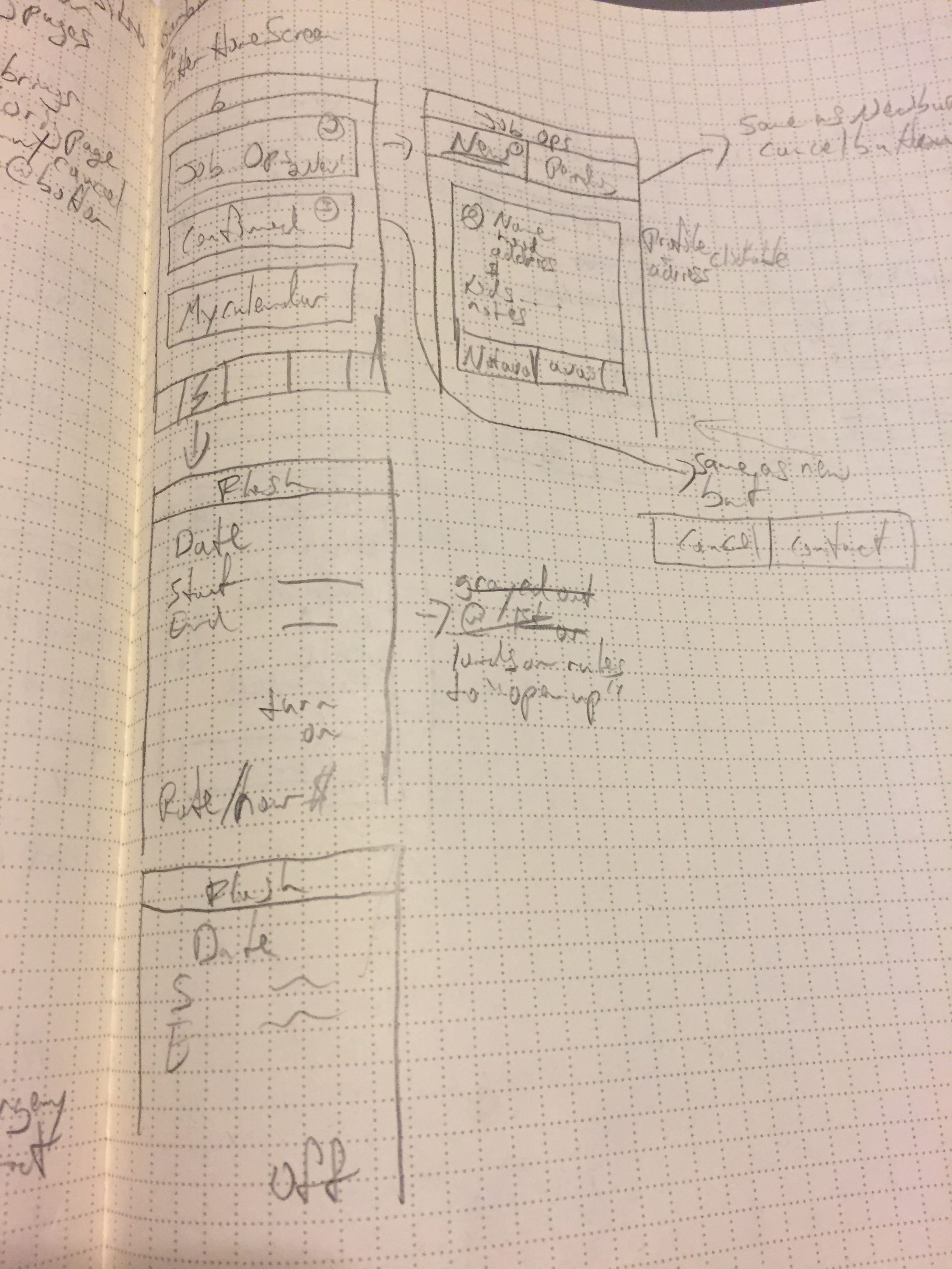
Sketches
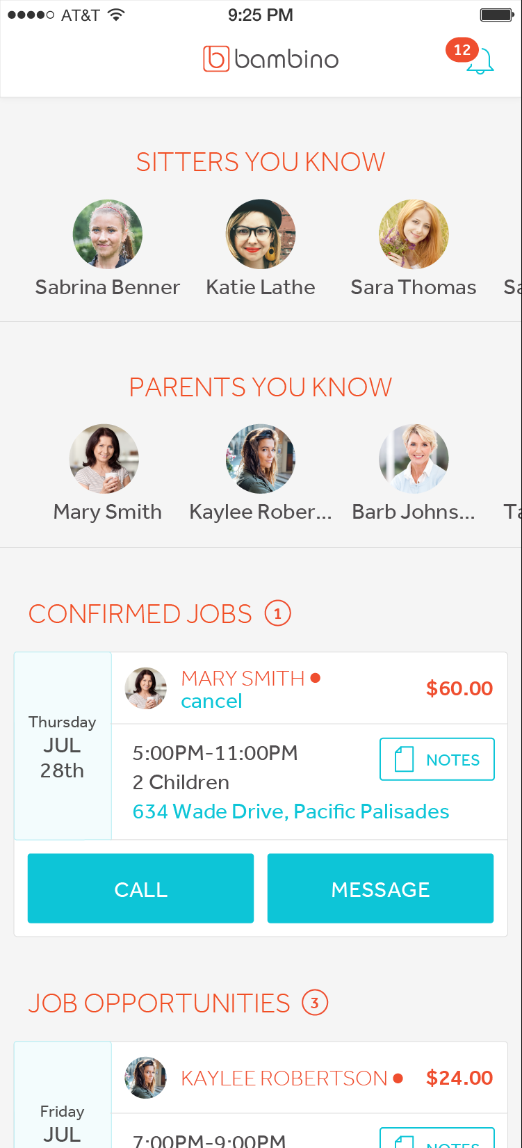
I was tasked with working up the new home screen for both the parents and sitters.
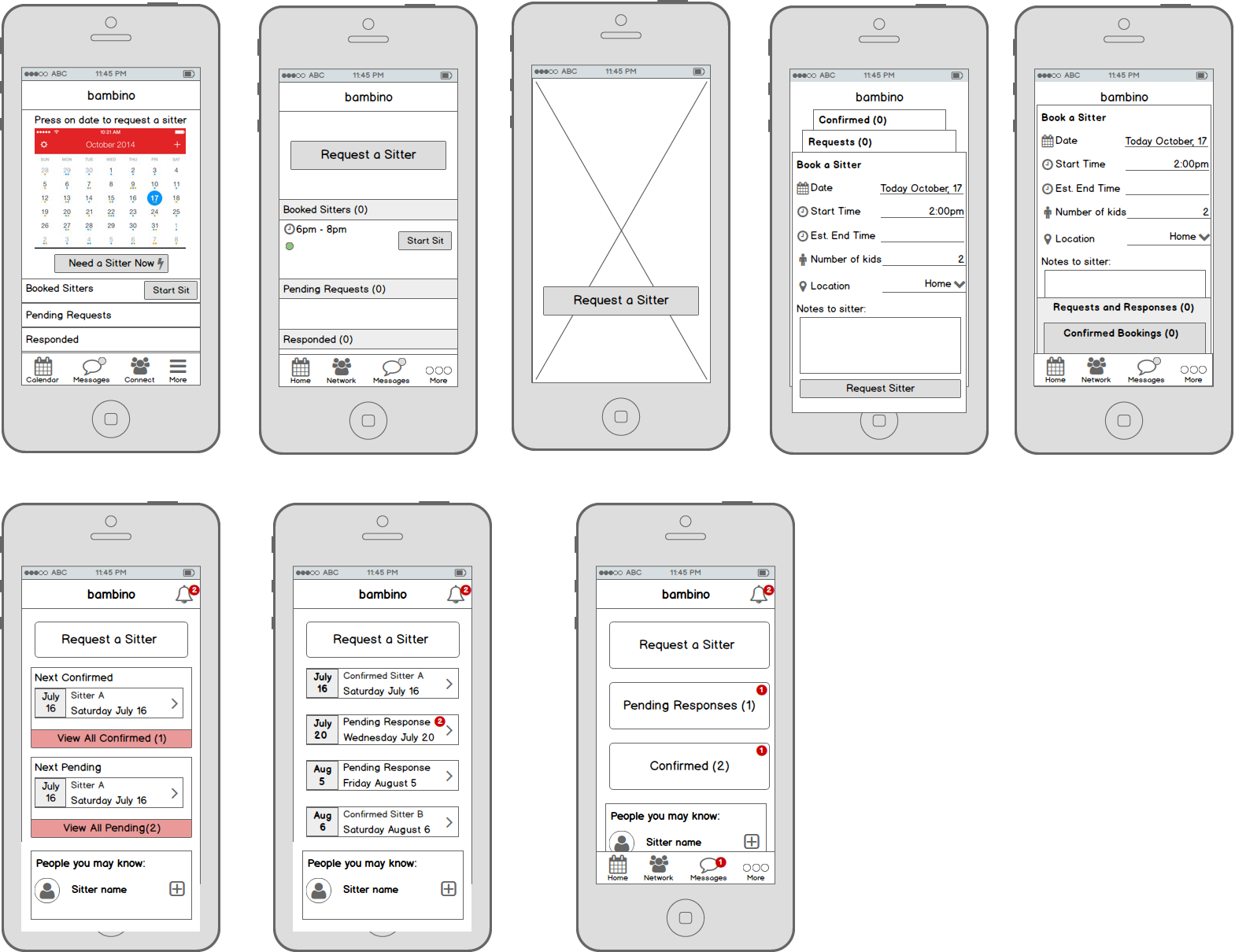
Wireframes
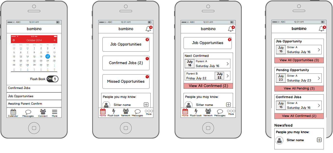
I went through a lot (really!) of iterations. These are options for the homescreen for both the parents and the sitters.
I wanted to explore a few different options and discussed with the developers along the way to see what was feasible.
After a few more iterations we worked on the hi-fi version in the new look and arrived at this new home screen for the sitters.
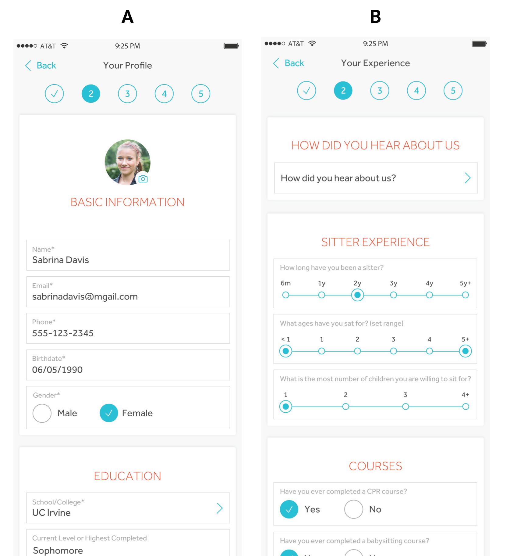
A/B Testing
There was an internal question as to the best questions to ask the sitters first; basic information or experience.
We ran a quick A/B test online and found that most users preferred A. Basic information.
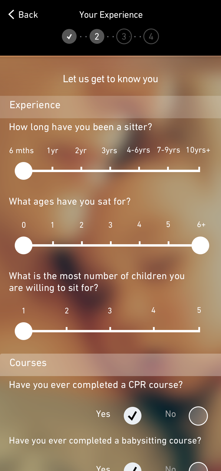
Hi Fi Wireframes
We were given the green light to add the sitter registration into the app.
This increased sitter registration by 70%!
More Metrics
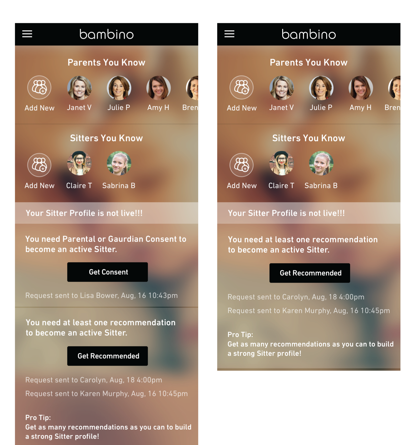
We were also able to update the sitters home screen so that they knew where they were in the process for becoming “live” within the app.
This increased sitter sign up completion by 65%.
Check Out the Live Product
Note: (ReSkin UI done by Zippy Zealous)
